

You must log in or # to comment.
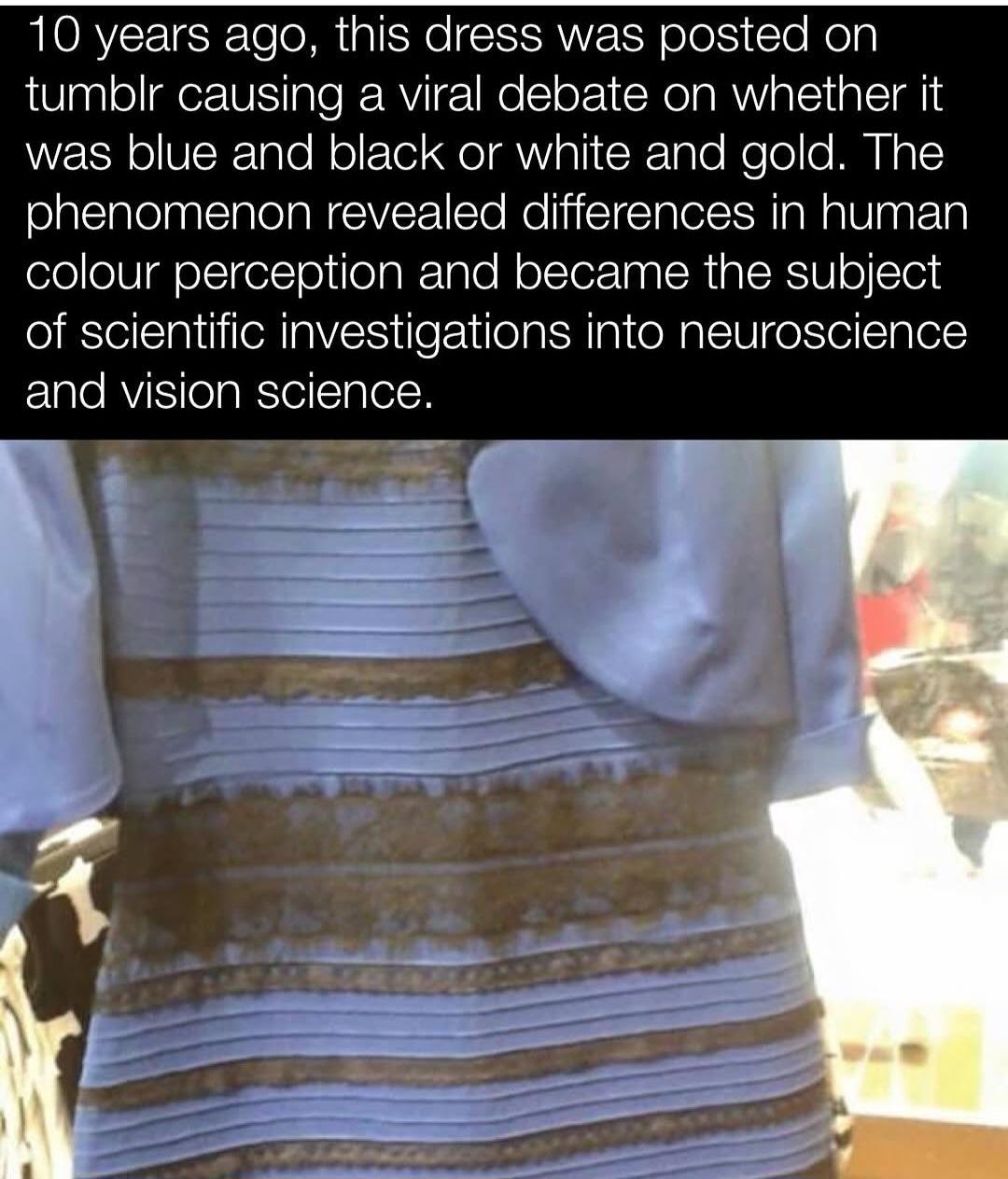
I’m still convinced this is the biggest troll. It’s clearly white and gold
I’ve always really liked this explanation image you can find on Wikipedia page for it. Essentially, people who see white and gold are mistaking the lighting to be cold and blue-tinted, rather than warm and yellow-tinted.

The portions inside the boxes are the exact same colors, you can easily check this with a color picker.
If theyre the same color, why can i see the black outlines way clearer in the yellow dress w/ blue tint side ?
That would be because the outlines themselves are not the same colors, just the blue/white and black/yellow sections. Here’s an image I quickly edited with the outlines and skin removed, so you can see just how much an effect they have on the image. Both dresses still look normal, but they no longer look like completely different colors when compared together this way.

(edit): And here’s the same image with the outer boxes removed, to show how much the lighting is affecting things, where one of the dresses just looks completely wrong to me now.

You can literally sample the rgb values and see it’s blue and black
Edit: am I part of the joke here??? It’s clearly blue and black…
am I part of the joke here??? It’s clearly blue and black…
The objective fact is…it is a blue and black dress. Other photos of the same dress show that.
But I cannot, for the life of me, see how anyone can possibly get that from this photo. Sample the RGB values all you want and it clearly is not black in this photo. The exposure and white balance have messed around with it so much it is incomprehensible to me how anyone can see it as blue and black.

Optical illusion innit
If anything, I’m more interested in how THAT color is being interpreted than the dress itself. Does it become shade to people because they perceive it relative to the dress? Because, I mean, we know that it is factually light. So how are people perceiving it to be the absence of light? Can you explain that bit?
The brain doesn’t just read raw brightness; it interprets that brightness in relation to what it thinks is going on in the scene.
So when someone sees the dress as white and gold, they’re usually assuming the scene is lit by cool, natural light — like sunlight or shade. That makes the brain treat the lighter areas as a white-ish or light blue material under shadow. The darker areas (what you see as black) become gold or brown, because the brain thinks it’s seeing lighter fabric catching less light.
You, on the other hand, are likely interpreting the lighting as warm and direct — maybe indoor, overexposed lighting. So your brain treats the pale pixels not as light-colored fabric, but as light reflecting off a darker blue surface. The same with the black: it’s being “lightened” by the glare which changes the pixel representation to gold, but you interpret it as black under strong light, not gold.
It appears white/gold to me on it’s own, I’ve never been able to see anything different.
Grabbing this specific image and sampling the colours though; they appear more of a grey/brown colour. I can sorta maybe understand blue, but definitely not black.
This is just using Polish photo editor on android:

Why not an American photo editor?
A) I’m not American
And
B) America can go fuck itself until it sorts out it’s Nazi problem. I still think Canada should enact a full trade embargo and take our business elsewhere.
I mean… it was a dumb joke on Polish and Polish being homographs, but okay.
Woops
I missed that; bit of a sensitive topic atm…
I’m American. You have full permission to shit on us whenever you want. This place fucking sucks.

